A Design Problem
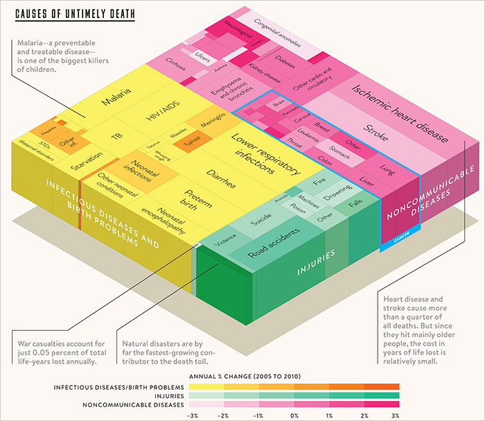
The following 3-D treemap was brought to our attention by a participant in our discussion forum.
[Scroll down to see our solution to this graph's design problems.]
[Click graph to enlarge.]
This graph was selected by Bill Gates to be included in a recent edition of Wired Magazine that he guest edited. He explained why he included the graph as follows:
I love this graph because it shows that while the number of people dying from communicable diseases is still far too high, those numbers continue to come down. In fact, fewer kids are dying, more kids are going to school and more diseases are on their way to being eliminated. But there remains much to do to cut down the deaths in that yellow block even more dramatically. We have the solutions. But we need to keep up the support where they're being deployed, and pressure to get them into places where they're desperately needed.
This is an important message and a noble goal. But how well does the graph above tell this story? Not very well, actually.
A treemap is a space-filling graph that uses the size of rectangles to encode one quantitative variable and color intensity to encode a second. This treemap was created by Thomas Porostocky to display worldwide years of life lost by cause using data from the University of Washington's Institute for Health Metrics and Evaluation database.
Let's see what we can learn from this graph. First, we notice that the green section representing injuries is significantly smaller than the other two, but the relative sizes of the other two sections are difficult to judge. Next, we see that the rectangles in the yellow section are mostly light yellow. If we check the color scale at the bottom it shows us that most of the diseases in that section are decreasing at an annual rate of between -2% and -3%. We can also see the names on the larger rectangles that represent the causes responsible for more years of life lost (e.g., Malaria), and get a sense of their relative sizes based on their areas, but again, we can't compare them with any accuracy. Treemaps were invented by Ben Shneiderman as a means to display part-to-whole relationships between huge numbers of values; data sets that are too large to display using graphs that can be more easily and accurately read, such as bar graphs. Only with a huge set of values would it make sense to rely on the areas of rectangles and the intensities of their colors to represent values, given the fact that our brains cannot interpret these attributes of visual perception easily and accurately.
The 3-D effect that's been added to the treemap doesn't provide us any information and makes the treemap harder to decode. One problem introduced by this effect involves the darkened colors that appear on the sides of the treemap to represent shadows, which are meaningless and misleading. 3-D graphs are rarely a good idea, but this 3-D is completely gratuitous.
If a treemap had been the best way to show this information, it would have been better to separate the three major sections using borders rather than different colors. Then a single diverging color scale could have been used for the whole treemap. For instance, negative values could have been varying shades of red, values near zero could have been gray, and positive values could have been varying shades of blue. This would have made it significantly easier to decode the values—especially the values near zero, representing little change—than the current design that uses three different sequential color scales.
There is another problem with the treemap, though it's not apparent unless you look at the underlying data. The color scale in the treemap shows annual percentage changes ranging from -3% to +3%. However, some of the items in the treemap changed by larger amounts than this. For instance, between 2005 and 2010 the years of life lost per 100,000 people to malaria decreased by 23.80%, which is an annual percentage reduction of 4.76%. This is a great improvement, but this outlier is completely lost when viewing the treemap, which shows malaria as one of the many infectious diseases that decreased annually between -2% and -3%.
A Solution
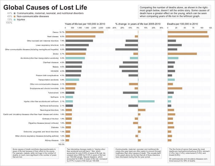
The information that appears in the treemap can be easily shown in two side-by-side bar graphs in a way that tells the story clearly and accurately and is just as visually engaging without resorting to gimmickry. In fact, by using a third variable to display information about the death rate for each cause, instead of solely showing the information in terms of years of life lost, the story can be enriched to give a clearer picture of the world. Here is our redesign:

[Click graph to enlarge.]
The bar graph on the left shows the years of life lost per 100,000 people in 2010 for each cause, which is the information encoded by the areas of the rectangles in the original treemap. The bars have been ranked and color coded to make it easy to compare causes of death. The years of life lost to each cause as percentages of the whole are also shown in the column of text, just to the left of the bars.
The bar graph in the center shows the percentage change between the years of life lost per 100,000 people in 2005 and 2010 for each of the causes. Unlike the original graph, we're showing the total percentage change between those years, rather than an annualized version.
The bar graph on the right displays information that's not shown in the original treemap: the death rate per 100,000 people for each cause. The fact that this information can be viewed together with the years of life lost information is useful and we'll examine it in more detail a little later.
You might notice that our bar graphs include fewer items than the original treemap. The original treemap contains a little over 100 rectangles, many of which are unlabeled. We had access to the original dataset, so we could have made bar graphs that included items for each individual disease, but we decided it would have undermined the core story to include dozens of tiny bars, so we decided to aggregate the data into useful categories. For instance we aggregated all different types of cancer into a single "Cancer" bar and all different types of heart disease into a single "Heart disease" bar. Also, for items that contributed less than 1% of total deaths, if they couldn't already be aggregated into an obvious category like cancer, we moved them into an "Other" category. For instance, deaths from diphtheria are included in the "Other communicable diseases (including meningitis and hepatitis)" bar. In cases when access to these lower-level details is important, a table containing all individual causes of death could be included to provide this information.
Notice how much easier it is to interpret the values represented by the bars than it was to decode the rectangle sizes and color intensities in the treemap. The fact that fewer years of life are being lost to communicable, maternal, neonatal, and nutritional disorders, represented by the gray bars, is immediately obvious, because all of the gray bars are showing decreases (negative values) in the center graph. By placing the years of life lost rate and the death rate for each cause in close proximity to one another, it's easy to find discrepancies between their patterns, which can be informative. For instance, most of the gray bars have relatively short death rate bars, in comparison to the bars that represent years of life lost. This is because many of the gray bars represent diseases or issues that tend to kill children, so each death results in many years of life lost. For instant, on average, each death from malaria robs someone of 67.2 years of estimated life. Conversely, the three largest brown bars, "Cancer," "Heart disease," and "Stroke" all represent things that tend to kill older people, so each death has a relatively lower impact on years of life lost. For instance, each death to heart disease, on average, is responsible for an estimated 17.5 years of life lost.
By using bar graphs, we've made it easier to interpret and compare the data, so that it's easy to focus on the stories contained in the data, rather than struggling to decode an inappropriate and ineffectively designed display.
