A Design Problem
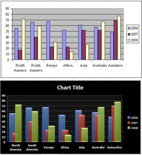
I found the following set of bar graphs at www.mrexcel.com in an article that explored the new features of Excel 2007. Mr. Excel credits http://blogs.msdn.com/excel/ as the original source of these images.
[Scroll down to see our solution to this graph's design problems.]
My Analysis
These charts were created to show the superiority of Excel 2007’s new charting engine (bottom) compared to earlier versions of Excel (top). I agree that the top chart needs improvement: its design distracts from the data and is just plain ugly. My comments, however, will focus on the so-called “superior solution.”
If you wanted to hang some abstract art on your wall, the bottom graph would serve nicely. As a work of art, it is the more attractive of the two. It’s when it comes time to actually decipher the data that the problems begin.
Although it is presented as cutting edge of technology, the bottom chart uses a black background with white text, a relic from the early years of computers. In the past, the use of white or other light text on black emerged from necessity; early monitors and projectors simply weren’t bright enough to clearly display black text on a white background without annoying flicker. As such, white text on a black background was used as a compromise, which is no longer necessary. Most modern graphs should use a white or off-white background to allow the information itself (points, lines, bars, etc.) to stand out clearly in contrast.
Here are a few of this graph’s problems:
- There are several distracting (and detracting) visual effects: the reflection of light, transparency, and 3-D effects on the bars (and squares in the legend) add no value.
- The bars have been overlayed on one another, which partially obscures the first two sets and gives them different visual salience. Because the bars for the year 2008 appear in the forefront of each cluster, their greater importance is implied, which was probably not intended. While I can’t be sure, the graph’s original post date of 2005, suggests that these values are projections, albeit unbelievably volatile ones. Without knowing more about the data, I can’t say for sure, but the 2006 projections are probably the surest and most relevant, yet they are partly obscured by the other two years.
- Although the gridlines in this graph are thin and light, because these values are projections, we probably don’t need to know precise values. As such, the gridlines are not necessary.
- The bar colors are more intense than they should be. The use of high-intensity colors should be reserved for making important data salient. Regular data should be shown using less intense colors. After all, when you display all of your data to stand out, nothing does.
- The continents have not been ordered in a logical way. At the very least they could have been alphabetized, but, as we’ll see below, there’s almost always a better way to order your data.
- Although bar graphs are great for showing and comparing the magnitudes of different variables, they are inferior to lines for showing how the values change through time. Because the pattern of change through time is likely more important than the actual magnitudes of the individual values, a line graph would have worked better.
A Solution
Here’s my redesign:

Line graphs make it especially easy to see the patterns of change and to focus on trends. To avoid the clutter of seven lines on a single graph, I used “small multiples,” a series of seven small graphs, which vary by region, but otherwise look and work the same. Small multiples may be arranged vertically (shown above), horizontally, or in a matrix. Because this information is a projection (and so the exact magnitudes are probably not as important), I have made the assumption that the graphs should be arranged to make it easiest to compare the patterns of change for the various regions, which is why I aligned the years by arranging the graphs vertically. If the magnitudes of the lines were more important, then a horizontal layout would have been preferable, for easier magnitude comparisons. Notice that the horizontal label (showing the years) is only shown on the very bottom of the graph. This is all that’s necessary to show which part of each line belongs to which year. Duplicating these labels for each graph would have resulted in redundancy and clutter.
I have reordered the continents based on the 2006 values, with the highest at the top and the lowest at the bottom. I based the sequence on the 2006 value because, as these values are projections, the first year is likely to be most reliable and of greatest interest to decision-makers.
This new design is clean and clear—free of the visual distractions in the first two examples. Anyone viewing the graph would be able to examine the data, focusing perhaps on the large declines that are projected to occur in Europe and Africa, instead of the pretty, shiny bars.
